There are many different things that you can do with Blogger. These things include:
- Making it your own, to suit you
- Uploading your photos
- Uploadng your videos
- Add a video bar which shows videos from other websites such as Youtube,so you viewers don't have to leave your site
- Adding a link list, which is all your favourite links and websites
- Adding a newsreel. This allows you to have current headlines posted to your blog from Google News.
How I think Blogger will be useful for my coursework
There are many different ways in which I think Blogger will be useful for my coursework.
These include:
- All of coursework being in the same place together
- Being able to access it from both home and in college
- Being able to see what I have and haven't done
500 Word Analysis
 Men's Health magazine.
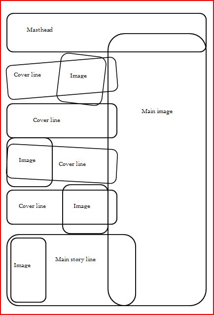
This is a flatplan of my front cover

This is a flatplan of my contents page

This is my first attempt of what I have been designing so far.

Music magazine- Research

Men's Health magazine.
The target audience for this magazine is males. This is because it is based around men’s health and fitness. There is a male model on the front cover, who is has a lot of muscles and has the type of body that a male who is concerned over the way he looks would want. The audience that would buy the magazine would be very conscious about the way he looks and would be looking for a number of ways to improve his body. I think this male would be middle class, and in his spare time likes to take his time over working out and concentrating on what his body looks like. I that if he was that into his fitness, that possibly he may have gym equipment which would mean he has the money to afford it. The magazine itself is approximately four pounds a week, and therefore again would need to have that kind of spare money to spend on a magazine. These males could either be single and wanting to improve their look so that they can maybe find themselves a partner or in a relationship/married and just looking to enhance their looks. I think that it is aimed at men of the ages twenty to thirty, because this is the age group where most men take pride in what they look like and like to make the effort.
The cover appeals to this type of audience because of the model that they have used. They have picked someone who has a lot of muscle and his is quite young. This would capture the audience’s eye as it is something they might wish to look like. The masthead itself is straight to the point ‘Men’s Health’. This is then directly aimed at males straight away because it is directly aimed at ‘Men’. It is also red and this colour stands out against the rest of the cover because it jumps out making the audience notice it even more. The cover lines that have been used on the cover also draw the attention in of the audience too. Some of these cover lines include ‘Your perfect Body!’, ‘More sex, less begging’ and ‘9 ways to work less and live rich’. All these types of cover lines are exactly what a male person would be interested to and this then pulls them in straight away, and by making them cover lines it will make the reader want to buy the magazine to find out about each one. There is also only one other image on the cover of the magazine which is of a woman, another interest of a man and something that would attract him more to the magazine.
The conventions that have been used on the front cover include; masthead, dateline, main image, cover lines and a main cover line. All of these things that have been used on the cover are vital for the magazines selling point. This is because it includes all of the main information that pulls in their audience to get them to pick it and then buy it.
Initial Ideas, Proposla and Flatplans
Initial ideas
My first thoughts for my front cover are that it will include a medium to close up view of a college student who looks happy to be a part of South Downs. It will make the college look a friendly place and promote the magazine more. It will include cover lines such as recent news about the college, latest things happening in and around the college and story lines based around students in the college that may have achieved something. It will also include smaller images based around what kinds of things they are likely to find in side. For the contents page, there will be a list of everything that the students will find in the magazine, smaller images that relate to some of the headlines on the contents page, competitions that they could take part in, and a voucher. Because of it being a monthly magazine, there will be a voucher within it that gives them something free from a café within the college, or money off in the college shop and each month it will be a different offer on the voucher. This will increase popularity for the magazine as the students have a chance to get free/or money off things in and around the college.
The types of colours I plan to use consist of greens, blues and white. These will be my three dominant colours as they are the colours from the logo and therefore make the magazine recognisable to the audience of what it’s about. I will also include other colours such as red, black and yellow, but these will be used a lot less but will make the magazine look a lot more interesting and will appeal to the students more because of the colours. If the magazine was just kept to a minimal use of green, blue and white, it would make the magazine look very boring and young teens would not be interested in reading it.
The types of colours I plan to use consist of greens, blues and white. These will be my three dominant colours as they are the colours from the logo and therefore make the magazine recognisable to the audience of what it’s about. I will also include other colours such as red, black and yellow, but these will be used a lot less but will make the magazine look a lot more interesting and will appeal to the students more because of the colours. If the magazine was just kept to a minimal use of green, blue and white, it would make the magazine look very boring and young teens would not be interested in reading it.
Proposal
· I am creating a magazine based around South Downs College. My magazine will be aimed at students either attending the college already or students who are possible considering attending the college in the new academic year. It’ll be aimed at ages 16-18 because this is the average age for starting college and also is the most popular ages for people attending college.
· The magazine will be about the activities that the college run, the opportunities the college offer, trips that the college is organising, stories from students within the college and their own experiences, competitions and vouchers.
· The types of cover lines that my magazine will have displayed on the front cover will be recent news about the college, latest things happening in and around the college and story lines based around students in the college that may have achieved something.
· I have decided that my title will be ‘South Downs College Student Magazine’. I will present this in a way in which the ‘South Downs College’ will be smaller but still readable so the students know what the magazine is about and the ‘Student Magazine’ text will be larger. This is because the buyers in the shop will know that the magazine is aimed at students and also for any students that are passing by and looking around will notice the word student and therefore may want to have a look at it.
· The type of font i will use throughout my magazine will be Berlin Sans FB. The reason for this is because it looks fun, but also still professional for a magazine. I didn't want to choose a font that looked to boring as students wouldn't then be interested in it.
· The first issue will be published at the beginning of April. This is because this is the time most school students start to consider looking at colleges and what they have to offer. A sub heading for this magazine would be ‘Choosing the right college for you’. The reason for this will be because the contents of the magazine will be based purely what the college has to offer for new students and why they should pick this college over any others. The magazine will run monthly, and each month will include information on different events and trips happening within that month and more information and updates from around the college.
· The first issue will be published at the beginning of April. This is because this is the time most school students start to consider looking at colleges and what they have to offer. A sub heading for this magazine would be ‘Choosing the right college for you’. The reason for this will be because the contents of the magazine will be based purely what the college has to offer for new students and why they should pick this college over any others. The magazine will run monthly, and each month will include information on different events and trips happening within that month and more information and updates from around the college.
· The kind of image I will use on my front cover will be of a current student at the college that looks happy. This is because it makes the college look a friendly place and will promote the magazine in a good way to any possible students that may want to come in the future.
· My magazine will be A4, this is because this is the most common size of a magazine and if a student it buying it, they will more than likely not want to carry round anything bigger than this.
· The images I will use on my contents page will be photos from around the college. This will help to give the students a feel of the college before reading on in to the magazine. I will use colours such a blues, greens, and white. My reason for choosing this is because these are the colours of the South Downs logo and therefore keeps the magazine related all together. I will also use other colours that will be bright so that it doesn’t look to boring and so that it appeals to the younger target market.
This is a flatplan of my contents page

This is my first attempt of what I have been designing so far.

Music magazine- Research

The masthead on this magazine is at the top but the main image on the magazine covers two words of the masthead. As this title is very well recognised, it doesn’t matter to much that the main image is covering some of the words.
Instead of having the main image on the right hand side of the magazine, they have placed it dead centre and cover lines are on both the left hand right side of the magazine. The main cover line, that goes with the main image is put into a circle and this makes it stand out more, and will be the first thing the audience see when looking at the magazine.
All the images that are placed on the magazine are scattered around the page, and the cover lines to that image are next to them. This makes it easier to understand what story goes to whom. Although some images are placed within shapes, the actual photo falls outside of the shape as well.
I would say that the magazine is aimed at the younger generation, probably in the teen years, as this is a very mainstream magazine based around all the latest artists that are out. I would also say that the magazine is aimed at girls. The reason for this is because the main use of colour is pink but different shades of it. Also, the majority of the images that have been used on the front cover is male groups and male artists. This would appeal more to the female audience, as males would not be interested in reading about groups of their own gender.

The masthead on this magazine is in the left hand corner and stands out. The reason the masthead is in the top left hand corner is because when the magazine is being displayed on the shelf in a shop, the first thing they will see is the masthead.
The main cover image on this magazine is on the right hand side. The cover lines are kept to the left hand side and the reasoning for this is because this is the side that will be shown when published on a shelf.
The main use of colour is based around red and black. As this is a rock magazine, these colours suit it and their target audience. The target audience for this magazine would be the kind of people who are interested in this type of music. They may also be influenced by who the main image is on the front cover or interested in the cover lines and would buy it for the reason that they want to find out what they are about.
What makes the inside of a music magazine good?
To gather this information, I did a tally chart and looked through 3 music magazines and scored down how many of each characteristics the magazine had. The three magazines I looked through were NME, HAMMER, and Bass Guitar Magazine. I added up the score and filled in a table to show my results.

From this table we are able to see which were most popular throughout each magazine and this would be the reason for it selling. We can see that a good content would include; information on gigs, interviews, posters, music charts, and gossip. Each of these were more dominant than the other characteristics, and can see that these would be the things theat help to sell their magazine. The reason these make a good content is that some people will only by the magazine for the people featured inside or who they see on the cover. This can some times be a big influence on whether they buy the magazine and therefore by including posters on artists/bands who they like, this will make them want to buy it because they get a free poster. By including exclusive interviews within the magazine, the target audience will get a chance to read something exclusive about the artist/band that no over magazine will have an interview about and therefore they may buy it for that. Also, if the reader knows that they can get first view of upcoming concerts/gigs/tours from the artists/bands inside, this will make them want to buy the magazine as they will find out information on where the tickets can be brought, and also the venues. This means that they wont miss out. The magazine will also be good if it includes the up-to-date chart list so that people know the top singles/albums for that week, or if it includes new singles/albums that are being released they get to know first and where they can be brought and how much for. Gossip is also a big seller within any magazine too, but by putting it in to a music magazine and having gossip about the artists/bands, the readers will be able to find out all the latest that's happening and then can share it on with the people they talk to.

From this table we are able to see which were most popular throughout each magazine and this would be the reason for it selling. We can see that a good content would include; information on gigs, interviews, posters, music charts, and gossip. Each of these were more dominant than the other characteristics, and can see that these would be the things theat help to sell their magazine. The reason these make a good content is that some people will only by the magazine for the people featured inside or who they see on the cover. This can some times be a big influence on whether they buy the magazine and therefore by including posters on artists/bands who they like, this will make them want to buy it because they get a free poster. By including exclusive interviews within the magazine, the target audience will get a chance to read something exclusive about the artist/band that no over magazine will have an interview about and therefore they may buy it for that. Also, if the reader knows that they can get first view of upcoming concerts/gigs/tours from the artists/bands inside, this will make them want to buy the magazine as they will find out information on where the tickets can be brought, and also the venues. This means that they wont miss out. The magazine will also be good if it includes the up-to-date chart list so that people know the top singles/albums for that week, or if it includes new singles/albums that are being released they get to know first and where they can be brought and how much for. Gossip is also a big seller within any magazine too, but by putting it in to a music magazine and having gossip about the artists/bands, the readers will be able to find out all the latest that's happening and then can share it on with the people they talk to.
These would all make a good content for a music magazine as they are all unique selling points, and by adding all of this in would help the magazine sell well, as people will buy it for those reasons above.
Target Audience of a music magazine
To find out what was the most likely target audience of a music magazine, Idecided to carry out a survey. Here are the results.

To find out what was the most likely target audience of a music magazine, Idecided to carry out a survey. Here are the results.

From looking at these results we can see that most likely age to buy a music magazine is 16/17 with 5 people answering yes to buying a music magazine. If I gave my survey out to more people than just within my class, i would of been able to find out if a higher number of students would buy magazines at a higher age. he reason i think this is the most popular age to buy music magazines is because this is the age that most people keep up to date with the latest music and also who want to know the latest gossip. From the results we can see that both male and female students buy music magazines epending on the genre. For example, if there was a magazine based around male artists and bands, and their colour scheme included pink, you would expect this to be aimed at females, and therefore males would not buy this as it's not the kind of thing they would want to read. Also by looking at the results and seeing how muc some people pay/willing to pay, I would expect them to have some kind of income to afford them. I think this because if they want to keep up-to-date with the music, they will pay for a weekly magazine they read, but also if the person on the cover, or inside is someone who appeals to the target audience, they will not want to miss out on the magazine. From the people that I surveyed, it is clear to see that most people buy a magazine because of the front cover/ cover lines or main image. This would help them decide on whether they want the magazine because if there is nothing on the front cover that appeals to them, they arent going to want to by the magazine. Also, the most common thing that these students would like to find in a magazine is interviews. They would want to read about their favourite artists/bands, and therefore this is why this would be the most favourited. Looking at the results of favourite music genre may reflect upon whether they buy magazines, and their answer to that question. This is because if there is not a magazine out there that sells the magazine based around their favourite genre of music, they are more than likely not going to be buying music magazines.
On the NME website, they claim that 65% of their target audience is male, and that 50% falls between the age of 16-24 and only 23% 25-34. This backs up my point about mostly the younger generation wanting to read music magazines to keep up to date on the latest gossip, gig information and news.
http://www.nme.com/mediapack/
I then went on to the Top Of The Pops website and on here they claim that they are 'the UK's best-selling teen gossip mag'. The also say that 'Every issue is packed with amazing star gossip, plus hot fashion and beauty advice, sexy lads,' this instantly jumps out to the female target audience as fashion and beauty is usually at the top of every girls list alongside 'sexy lads'.
http://www.totpmag.com/
Proposal
I am creating a magazine based around chart/mainstream music. My magazine will be aimed at people who listen to mainstream music/chart music. It’ll be aimed at ages 14-20 because this is the age that is most popular within other magazines' target audiences'.
The magazine will be about the latest music released, the new comers within the industry, and include exclusive interviews, gig information and posters.
The types of cover lines that my magazine will have displayed on the front cover will be recent gossip about the artists/bands, what interviews there will be, what posters can be found and all the latest from the charts.
I have decided that my title will be 'You Dream Mainstream'. The reason I have decided to call my music magazine this is because some people may want more mainstream magazines out there so they can keep up-to-date with all the latest, and therefore by naming my magazine this will jump out to the tagret audience that this appeals too.
The type of font i will use throughout my magazine will be Hobo STD and Ridiculous. The reason for this is because it looks fun, but also still professional for a magazine. I didn't want to choose a font that looked to boring as the younger generation wouldnt want to read it.
The first issue will be published on the first Tuesday in June. The reason for my choice is because as it is the start of a new magazine, as it will be ready for release around this time, i thought that by publishing it at the begining of the half way mark would be a good idea.
The kind of image I will use on my front cover will be of the new comer for this time of year. I have decided on this so that people will pick up the magazine and want to find out about the newest person within the music industry, and because it is based around mainstream music, also what the 'in thing' is for this time of year to help keep the audience up to date too.
My magazine will be A4, this is because this is the most common size of a magazine and if the younger generation are going to be carrying it, they are not going to want to carry anything bigger.
The images I will use on my contents page will be photos of bands and artists. Some will be related to their interviews, some to gossip and others to information on gigs. By including a varitey of images of bands and artists, this will help to increase the sales as they will see people on the front of who they are interested in making them want to buy and read more in to it.
These are the flat plans to my Music Magazine
This is the flat plan to my font cover.

This is the flat plan to my contents page.


This is the flat plan to my double page spread.

Own examples of photography


All of the above images are photos I have taken myself. I plan to use them all within my magazine.